
🧬 Learning ggplot
On day five of the Applied Bioinformatics course, we explored the fundamentals of ggplot2 — one of R’s visualization libraries. We discussed principles of clarity, data storytelling, and how design choices can influence interpretation. After a short demo, we practiced building plots from scratch and then moved on to a small challenge: recreating an existing plot.
🎯 The Challenge
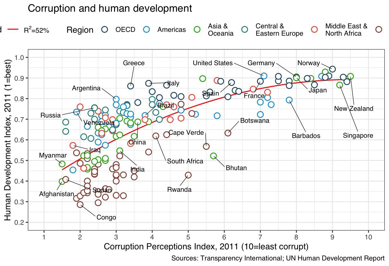
For the exercise, I chose to reproduce a plot originally published by The Economist.
It was a great way to apply ggplot’s layering logic (geom_, theme_, scale_), while learning to match color schemes, typography, and data layout.
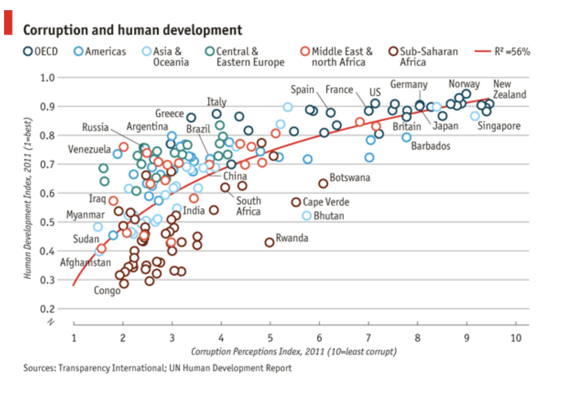
Here’s my recreated version using ggplot:
🧠 My own plotting experience
I mostly work in Python, so using ggplot felt both familiar and new.
In Python, I typically rely on:
- Plotly – for interactive visualizations
- Scanpy – mainly for single-cell analysis and dimensionality reduction (but I’ve also used it for image-derived features)
- Matplotlib – for fine-tuning plots and adjusting small details
What I like about ggplot is the structured, layered grammar of graphics — it forces you to think about how each visual element represents part of the data. It’s less “trial and error” and more concept-driven design.
✨ Key Takeaways
- Good plots are not just beautiful — they’re informative and reproducible.
- Aesthetic decisions should serve the message, not distract from it.
- Learning new plotting tools (like ggplot) expands how you think about data communication.